

DYLAN MUBURGH
Multidisciplinary Designer
SB Business One – Business Client Ecosystem
Team: Experience Design Engineering
Department: Customer Experience
Date: 4 July 2024
Platform: Web - Figma, Microsoft Teams, Jira
Skills used:
Problem Definition
UI/UX Design
High-fidelity clickable prototype
Translated feedback
Qualitative interviews
Storytelling
OBJECTIVE
To design a centralized platform to meet the needs of Standard
Bank’s business clients — enabling them to start, manage, or
grow their operations in one unified digital space. SB Business
One aimed to bridge existing gaps in service delivery and client
engagement by streamlining complex business journeys into a
cohesive, intuitive, and visually consistent interface. The goal
was to improve client access to tools, services, and support
through a unified product that showcases Standard Bank’s full
suite of business offerings.
Scope of Work
This project involved the creation of a conceptual digital
ecosystem for Standard Bank’s business clients — SB Business One
— designed to centralize key tools, services, and touchpoints into a
unified platform. I led the UX strategy, ideation, and wireframing
of the MVP, which included features like a booking hub for
consultations and site visits, a cross-team messaging interface,
and access to support services.
My responsibilities included defining key user journeys, translating
stakeholder needs into wireframes, and ensuring alignment with
Standard Bank’s digital brand. I also helped craft the pitch deck,
collaborating with product and CX leads to communicate the value
proposition in a format suitable for internal leadership and
investor buy-in.


PROBLEM
Business clients often experience fragmented digital journeys,
with inconsistent access to financial tools, onboarding friction,
and a lack of integration between key services.
These disconnected experiences increase client drop-off, strain
support teams, and inhibit scalability. SB Business One was
envisioned as a platform to consolidate those touchpoints
and provide a seamless business banking experience that
evolves with client needs.
Results
The SB Business One concept was well received by stakeholders
for its clarity and strategic value. The platform structure helped
highlight service gaps in the current business offering and
sparked internal interest in pursuing a more unified ecosystem
for business clients. The design deck was used in multiple
strategic conversations, serving as a foundation for long-term
planning discussions around business client digitization.
My design direction helped set the tone for future iterations and
proved the importance of experience design in early-stage
ideation.


SBG BroadPOS Project
Team: Product Solutions
Department: Merchant & Macro Banking
Date: 4 July 2024
Platform: POS Devices (SBG A920Pro / Legacy
Models)
Skills used:
Interaction Design Mapping
UI/UX Design
Constrained POS environments
User flows
Accessibility
Usability timelines
Design System Adaptation
Developer Handoff
Legacy Hardware
OBJECTIVE
The objective of this project was to breathe new life into Standard
Bank Group’s legacy POS devices by redesigning their interfaces
for modern usability, clarity, and merchant satisfaction. These
devices, widely used across the merchant ecosystem, suffered
from outdated UI logic, inconsistent visual standards, and long
onboarding curves — particularly for new vendors or informal
retailers.
The goal was to reimagine the interface within the physical and
technical constraints of legacy hardware while still elevating visual
appeal, accessibility, and cross-device continuity.
I was tasked with leading the UI/UX direction of this modernization
effort — from revamping core flows like Setup Wizard and
Transaction Handling to crafting dev-aligned specs that bridged
the gap between design intent and implementation. This was not
just a cosmetic update; it was a strategic UX transformation to
reduce training time, improve transaction confidence, and
support developers in achieving scalable, future-fit UI without
abandoning the existing hardware ecosystem.
Scope of Work
The project focused on redesigning core screens across legacy
Standard Bank POS devices used by merchants in physical
environments. My work spanned rethinking the merchant
onboarding flow, transactional screens (card payments, refunds,
voids, settlements), and other operational states. I was responsible
for UI/UX refinement, accessibility adjustments, and platform-
consistent styling aligned to Standard Bank’s design system.
Each screen was annotated in detail to support seamless
developer handoff, with attention to layout consistency,
information hierarchy, and error prevention patterns. The work
required adapting to strict hardware limitations, optimizing for
quick user cognition, and ensuring cross-device consistency
between newer Android-based systems and older hardware
terminals.

PROBLEM
Standard Bank’s POS devices, especially the SBG A920Pro and its
legacy variants, were becoming barriers to merchant efficiency.
Their outdated user interfaces created friction at every
touchpoint — from onboarding new merchants to handling high-
volume transaction spikes. Visual inconsistencies, inaccessible
components, and unclear affordances led to high user error rates
and poor task completion in real-world settings.
Beyond user issues, developers struggled to retrofit modern UI
components onto legacy screens without proper design
documentation or clarity on spec alignment. Accessibility wasn’t
built in, and many elements didn’t account for real-world stressors
like sunlight glare, time-sensitive transactions, or varied merchant
literacy.
The result: higher support calls, slower processing times, and
diminished brand trust in merchant-facing
environments.
Results
The revamped POS interface significantly improved usability for
both new and long-time merchants, especially during high-traffic
transactional flows. Merchant onboarding time was reduced
thanks to the simplified setup wizard, while the updated UI
delivered faster task recognition and improved error recovery.
Developers reported smoother handover due to the annotated
screens and consistent design tokens, resulting in quicker
implementation cycles. Feedback from internal QA and
merchant testing highlighted improved legibility, a more modern
look and feel, and fewer user input errors. Overall, the facelift
helped future-proof legacy POS systems, aligning them with
Standard Bank’s broader digital modernization goals.
BuyHub Journey
Team: Experience Design & Strategy
Department: Digital Platform Design, SB
Date: 28 November 2024
Platform: Figma, Adobe XD
Skills used:
Banking/e-commerce hybridisation
E-commerce benchmarking
UX/UI analysis
CTA hierarchy
Modular layout systems
Storytelling
OBJECTIVE
The goal of this project was to radically modernize Standard
Bank’s internal Buy Hub marketplace — transforming it from a
static, outdated interfaceinto a dynamic, high-performing digital
commerce experience. The redesign needed to be visually
premium, seamlessly navigable, and highly responsive across
devices, while still operating within the design system constraints
of Standard Bank’s broader ecosystem.
At its core, the initiative aimed to unify commercial offerings
(airtime, vouchers, electricity, deals) into one cohesive experience
that rivals leading retail platforms like Takealot. My task was to
enhance the user experience, sharpen visual hierarchy, and boost
engagement by making product discovery feel personalized,
effortless, and compelling.
Scope of Work
Led a full strategic redesign of the BuyHub journey by
benchmarking e-commerce leaders like Takealot, Amazon, and
Woolworths to extract UX best practices around navigation,
repeat purchases, and promotional clarity. I produced iterative
wireframes and high-fidelity refreshes, testing variations in layout,
CTA placement, and content hierarchy.
Product cards and CTA architecture were overhauled to feel
sharper and more intuitive, while a modular navigation system
was introduced to reduce friction and support smoother product
discovery. Partner offers and reward bundles were seamlessly
integrated without breaking design system constraints,
maintaining elegant hierarchy and spacing. The final stakeholder
deck outlined every decision with clear rationale, design
differentiators, and potential KPIs tied to business goals like click-
throughs and reward engagement.


PROBLEM
The existing Buy Hub interface failed to inspire action. Visually flat
and structurally fragmented, it lacked any sense of modern retail
logic or emotional pull. CTAs were repetitive, categories were
buried, and visual content was either inconsistent or poorly
prioritized. Users had to “hunt” for what they needed, which
reduced product uptake and frustrated engagement loops.
Even more pressing was the disconnect between banking services
and promotional content — while the bank had strategic
partnerships and UCount reward mechanics in place, the UI did
little to emphasize them.
Results
The redesign positioned BuyHub as a more competitive and
user-centric e-commerce experience within the banking
ecosystem. Stakeholders responded positively to the clear
rationale and depth of insight in the proposed solution, leading
to further interest in MVP exploration.
Early concept testing revealed strong user preference for the
cleaner navigation, improved product card clarity, and
integrated rewards visibility. The work sparked internal
conversations around expanding digital retail offerings and
demonstrated the potential for increased engagement, repeat
purchases, and cross-platform synergy between banking and
commerce.
Masterclass: Kids Banking
Team: Experience Design & Strategy
Department: Experience Design & Strategy
Date: 28 November 2023
Platform: Figma, Miro
Skills used:
Stakeholder expectations
Interactive flows
User simplicity
Inclusive Design
End-to-end flows
High-level conceptual UI
OBJECTIVE
Design a simplified three-page website experience that enables
parents to open a savings account for their children.
The solution had to communicate clearly to both parent and child
personas while offering intuitive functionality and engaging visuals.
Scope of Work
Developed distinct personas for both parent and child users to
capture dual-audience needs. Designed wireframes by hand
before translating them into polished digital prototypes. Created
multiple concept screens — including landing, product, and
application pages — to explore the user journey.
A visual onboarding process flow tied the experience together,
making the journey simple and intuitive for families.


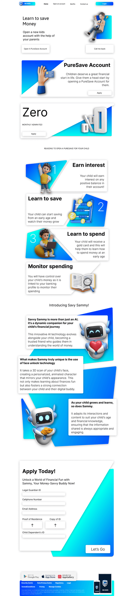
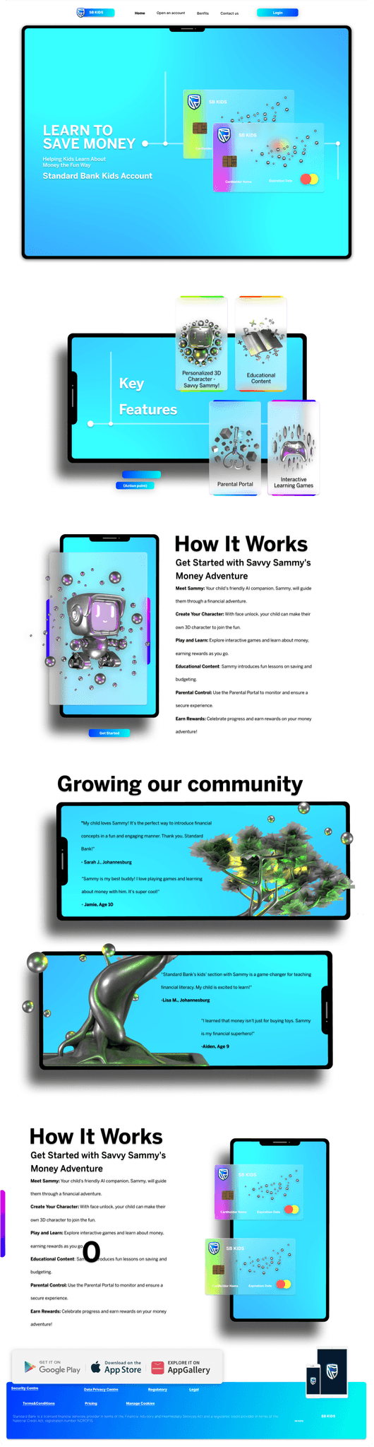

PROBLEM
Traditional child banking journeys were either too complex or too
focused on parents. The challenge was to create a balance
between UX simplicity and informative storytelling while meeting
regulatory and data requirements.
Results
My Kids Banking prototype received strong validation, with
parent and child personas helping define clear UX paths for each
user type. Testing showed that both the landing and application
screens delivered high clarity and ease of navigation. The illustrated
onboarding journey stood out, making account setup feel intuitive
and friendly. Based on this success, stakeholders approved the
concept as a foundation for future integration into the bank’s
broader youth strategy.
Debtor Finance: Competitor Analysis
Team: BCB (Business & Commercial Banking)
Department: Business, Commercial & CIB
Date: 16 November 2023
Platform: PDF
Skills used:
Content Analysis
UX Competitor Benchmarking
Visual Storytelling
Strategic Research & Framing
Finance Product Familiarity
OBJECTIVE
To conduct a comprehensive competitor analysis focused on
debtor finance offerings, examining the landscape across primary,
secondary, and tertiary players. The report was intended to inform
experience design decisions for future enhancements to Standard
Bank’s commercial finance product.
Scope of Work
I analyzed the UX, product features, and content strategies of
both local and global competitors, benchmarking their user
journeys, onboarding flows, and value propositions. This
competitive audit helped identify strategic whitespace for
Standard Bank to differentiate through improved UI/UX and
messaging. The findings were synthesized into a clean,
executive-ready presentation that was used across both strategy
and design teams.

PROBLEM
The existing debtor finance experience lacked clarity, both in
market positioning and user engagement. There was little
differentiation from competitors, and minimal insight into how
others framed their digital journeys, onboarded clients, or
maintained long-term service relationships. This created a
strategic gap in how Standard Bank could present and elevate its
offering.
Results
The competitive analysis clarified where Standard Bank could
stand out in debtor finance by simplifying onboarding, sharpening
messaging, and digitizing key touchpoints. Findings shaped high-
level strategy decks and seeded early design concepts for a more
intuitive, value-driven experience. The work aligned product,
marketing, and UX teams on a shared vision: positioning debtor
finance not just as a service, but as a growth enabler for SMEs.
Eco System Mapping
Team: BCB (Business & Commercial Banking)
Department: Experience Design & Strategy
Date: 23 October 2023 at 10:50
Platform: Figma
Skills used:
Product Ecosystem Design
UX Mapping
Systems Thinking
Experience Architecture
Stakeholder Alignment
OBJECTIVE
To visually map the digital and service ecosystem for Business &
Commercial Banking, identifying all product touchpoints, pain
points, and overlapping user journeys across core banking
solutions.
The goal was to create a strategic high-level visual that could be
used for planning, capability assessments, and future experience
design interventions.
Scope of Work
I audited product flows and user-facing screens across multiple
business units. I created a Figma master file to organize services by
product family and platform.
I also mapped customer pathways to identify overlaps and gaps in
user experience, collaborating with strategy and customer
experience leads for alignment with enterprise journey models.

PROBLEM
With dozens of disconnected platforms, services, and UX teams
contributing to a fragmented business banking experience, a
centralized ecosystem view was urgently needed to support
better cross-functional alignment and experience strategy.
Results
Created a comprehensive ecosystem map to assist Experience
Strategy with platform consolidation.
Provided stakeholders with a clear, centralized view of customer
touchpoints. Utilized in internal presentations to emphasize the
importance of journey prioritization and capability integration.
UX
Officially: how users feel when using a product.
Unofficially: how I turn “ugh, why is this so hard?” into “oh, that was easy.”
This category is where logic meets emotion — through
seamless flows, smart systems, and design that just makes sense.